
5 Ways to Humanize Your Fundraising Emails (and Why That’s Important)
The average officer worker now receives 121 emails a day. And your inbox, and mine, will only get more crowded in the coming years (it seems) making the need for your emails to stand out and get opened important. But that’s just the first step, what are you going to say, and how are you going to say it, if they do open?
Well, based on our research of 218 email experiments related to email messaging, here’s what you need to do:
Write your email like it is to a real person, from a real person.
It sounds simple, and at one level it is, but it’s a crucially important fundraising idea that can grow your online fundraising. For example, here’s an experiment from our research library where the control email was pretty good, informative, and used facts and figures to make their case to the reader:
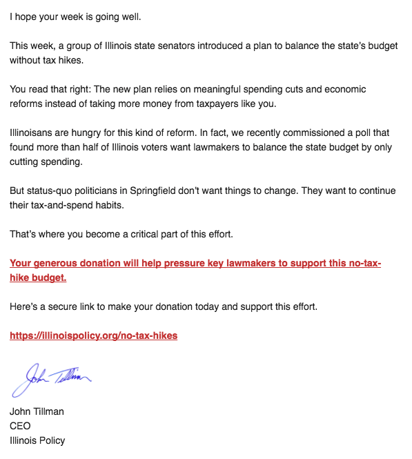
Not bad right?
But for the treatment, they wanted to ‘close the distance’ between the sender and reader by making the copy, tone, and voice, in particular, more personal. More human.
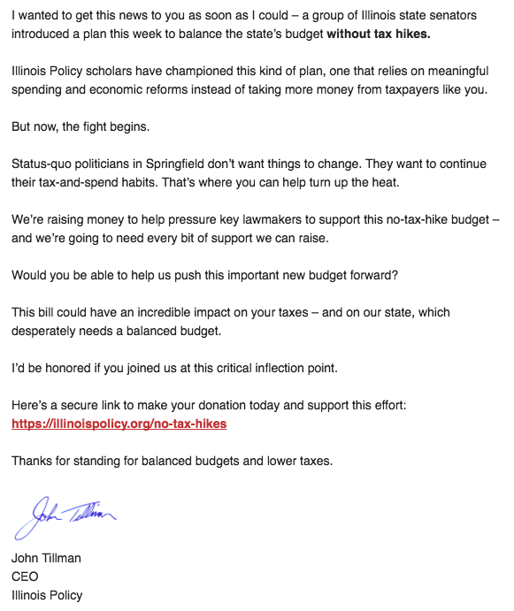
Do you see the differences? They are pretty small but the end result here was that the one that was more personal, increased donations 328%. And revenue? It increased 716.3%!
Being more personal is the high level idea that you should be infusing all the elements of your email with because it speaks to donors — you, me, humans — the way we connect with people. The concept that we treat digital experiences as if they are with real people is called social presence and it’s the social presence that separates those two emails from one another and it’s using social presence that can help you engage donors and separate your emails from those 120 other emails people receive each day.
We created a free online training course on email fundraising optimization that covers all you need to know but in this post let’s simply look at how you can improve them by fostering a 1-1 communication style through these 5 components of an email body:
- Design and Format
- Salutation
- Body Copy
- Call-to-Action
- Tone/Voice
1. Design and Format
Stripping down the design and branding of an email appeal is one of the first experiments we run with clients, one of the easiest things you can test in your next appeal, and one of the most consistent ‘wins’ we see in our library.
If you don’t believe me, check out experiment #4174. The control was their usual email:
Pretty standard email with the logo, image header, copy making the case, big call-to-action button, personal signoff, and a PS.
This isn’t a ‘bad email’ – according to best practices you’ll find online and from other organizations – and in many ways a pretty good one but the intent of this email is pretty clear and quite early. It’s a marketing email.
So we wondered what would happen if we took out the branding and even the template itself to create a more personal feel using the same copy and call-to-action button to make it feel less templated and designed and here was the result:
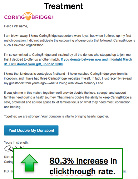
The stripped down email increased clicks to the donation page by 80.3% and because of that led to more donations.
But could we simplify and strip down even further? Let’s test it! Here was that new ‘winning’ email (now the control):
And this time for the experiment, we wanted to get even simpler and clearer with the ask so moved the logo/branding down to the signature block and took away the big button and replaced it with a hyperlink and ended up with this:
In this case, the more personalized email increased donations 145.5%!
Looking for more evidence? Check out experiment #5824. Or #7524. Or #7466. Or #6429. Or #483. Or… I think you get the point. Our experiments show time and time again that for fundraising emails less design is better.
Why? Because real people don’t send emails with logos, beautiful header images, and well crafted footers. Think about what design elements you’d have in a personal email to a friend or family member and try to mimic that.
Do you use a header image? A logo at the top? A button in it? A signature? If you wouldn’t send it to a friend, take it out of your design and test it.
Key Tip: Choose an email design that mimics what you would send to a friend.
2. Salutation
This is one of the first things people see and it’s also often taken for granted. “Easy” things like using the person’s name can do wonders for email engagement.
Here’s an experiment with the National Breast Cancer Foundation where we had no first name vs. with first name:
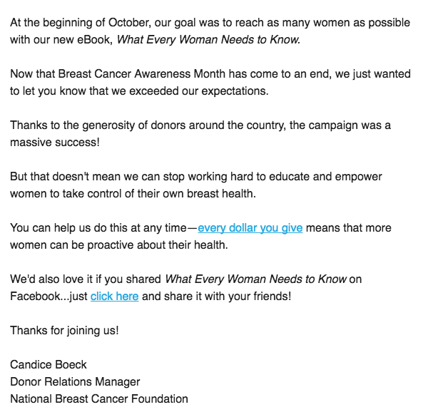
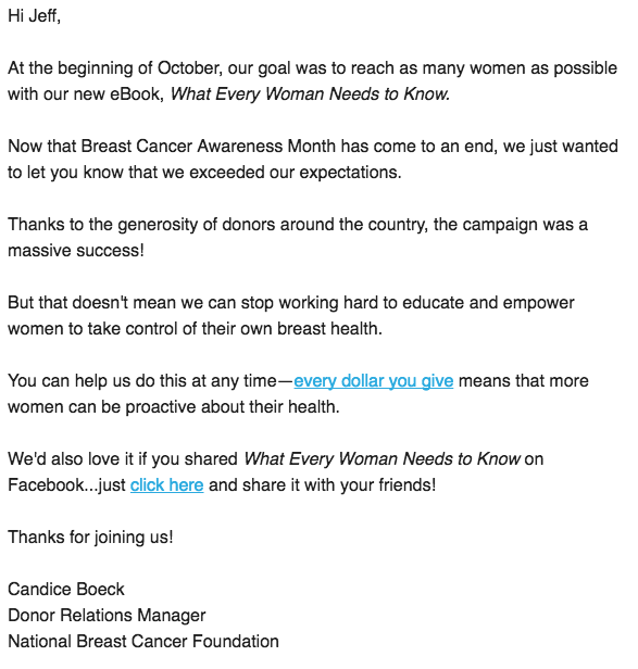
The email with the first name increased clicks 270%.
When real people send emails to real people they use their name!
Hopefully that truly is an “easy” one for you (and you shouldn’t have to test that one) but you can also make your salutation more relevant to the receiver with internal factors like:
- Personal interests – How about those Ramblers?
- Personality – Wazzzzzup?
- Level of engagement – you’
Or external factors like:
- Environmental changes – I hope you didn’t get the snow like we did…
- Holidays – Happy Holidays!
- Recent events – What a Super Bowl!
- Recent actions – Thank you for signing our petition!
These salutations work because… that’s how real people start conversations. So give it a shot in your next email.
Key Tip: Start a salutation with their name and, if possible, a personally relevant introduction.
Body Copy
The question I get asked most often when it comes to emails is, “how long should our email be?” And in response I twist the classic consultant ‘it depends’ answer a bit to be, ‘however long you need it to be to effectively answer the main value proposition question’:
“If I am your ideal donor, why should I give to you, compared to some other organization, or not at all”
If you can answer that question in a sentence, then great. Your email could be a sentence. If you need 1,000 words, then so be it. Your email can be 1,000 words. But more often than not, your emails need to be a bit longer than you think and our research has shown that again and again.
Because you suffer from something called the curse of knowledge — a marketer’s fatal flaw where we assume the reader knows much of what we know — you end up writing fundraising appeals that quickly go through things like the need and solution — the value proposition — and get to the ask before the reader has have enough info to make a good decision. And since inertia or gravity is going against people giving their money away, they don’t.
Or even if you do spend time trying to answer the value proposition question and featuring something like a matching gift, you may answer it in your own words or language full of acronyms, technical speak, and insider terms that the reader may not even understand.
You have to make sure you have enough content, aka copy, to let the reader know and understand what you’re asking them to do which is often more info as opposed to less. And the only real way to know what your donors respond to or if they get your value proposition is to run tests and experiments.
Donors will tell you they want shorter emails, with less copy, and just the stats. But after looking through over 218 experiments, I can tell you that longer emails, with more copy, and emotive language raises more money.
Key Tip: Before you make a request, make sure there is enough body copy to answer the question why… both for the email and for the request.
Call-to-Action
Alright, you’ve done the hard work. Someone has opened your email. They’ve read through the main body. Now it’s time to present the call to action and move them on ‘down the funnel’ (or up the donor mountain as we like to say). Be clear. Be direct. Be simple.
Do you want people to learn more? Will they understand what it means to ‘stand with you’? No. You want people to give so make that clear in your call to action. Learn more or ‘soft’ calls to action like ‘stand with us’ language may get more clicks but they’ll often get less donations (here’s one example and here’s another one).
And what about the design of the call-to-action? We’ve already covered that the more designed an email is the more it can appear like marketing so why not use basic links or even raw links like this: https://www.nextafter.com/research/2016/09/how-a-raw-link-in-an-email-affects-donor-conversion/
Key Tip: When you make a call-to-action request, be clear about your desire and intentions.
Tone/Voice
Remember the very first example with the slight differences that led to a 328% increase in donations? It not only was more ‘you’ focused and personal, it also was full of social cues and emotive language that a real human would use. Check it out:
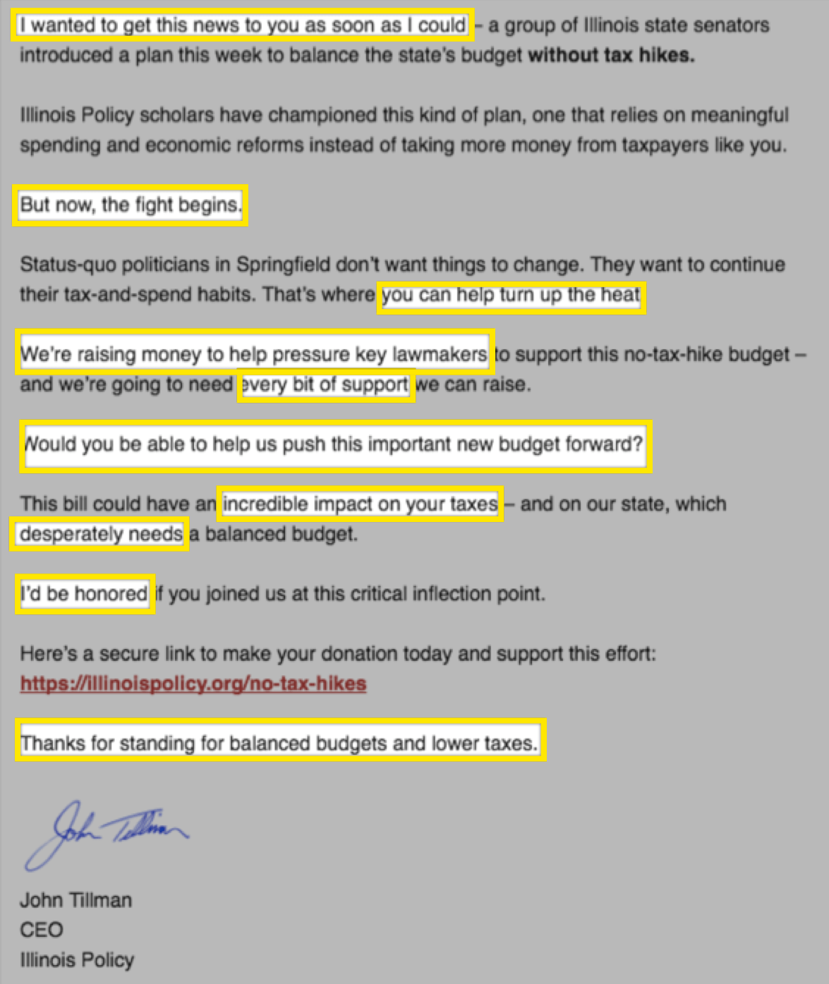
It is full of emotive words like ‘turn up the heat’,‘desperately’, ‘incredible’, and ‘the fight begins’ but also human terms like ‘I’d be honored’, ‘Would you be able to help’, and the opening ‘I wanted to get this news to you as soon as I could’.
The combination of personal terms and emotive language sets a tone and gives a voice to the email that can engage and entice readers so when they reach the call to action (notice the raw link) they are on board. They’re motivated. They’re ready to join the fight.
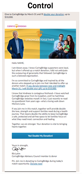
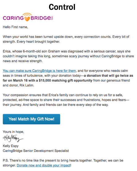
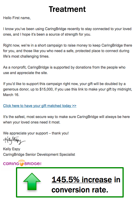
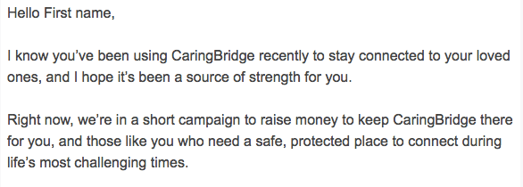
Or if you zoom in a bit closer to the CaringBridge example above you may have seen that, beyond the design, we made a few other minor changes around the tone as well. Take a look at the first few sentences of each email a bit closer:
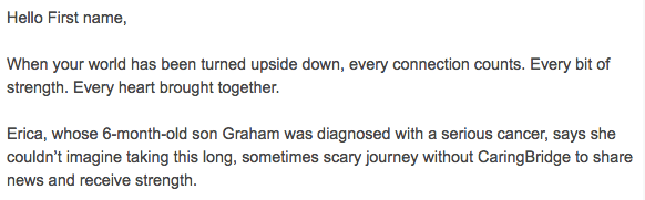
Again, the first email isn’t bad. It starts out fine enough, tries to develop some connection, and gets into a story. Another ‘best practice’.
But in the treatment, we used ‘I’ and ‘you’ language to be more like a human sending an email to another human and create a sense of empathy before jumping into the campaign even without the story ‘hook’.
The tone you have and voice you use through your copy sets the stage not just to lead up to the call to action but helps people put down their ‘I’m getting marketing to’ guard to engage with the content on a more personal and human level.
Key Tip: Read the email out loud and add/adjust content to account for tone/voice so it sounds like it is from a human, and makes you feel something.
Remember…
People give to people. Not email marketing machines. So best way to optimize your email fundraising is craft your email — from the design and format to the call-to-action — as if you were just one person writing to another.
Take the time and copy length you need to simply describe the value you are offering, don’t let your design distract from your message and connection, infuse some social cues, and clearly ask for a donation if you are indeed asking for a donation.
And just in case you skimmed everything up until now here is the…
5 Ways to Humanize Your Emails Summary
- Choose an email design that mimics what you would send to a friend.
- Start a salutation with their name and, if possible, a personally relevant introduction.
- Before you make a request, make sure there is enough body copy to answer the question why… both for the email and for the request.
- When you make a call-to-action request, be clear about your desire and intentions.
- Finally, read the email out loud and add/adjust content to account for tone/voice so it sounds like it is from a human, and makes you feel something.
Good luck!
Author Bio
Brady Josephson is a charity nerd, entrepreneur, digital marketer, professor, and writer. He’s the Vice President of Innovation and Optimization at NextAfter — a fundraising research lab and consultancy on a mission to unleash the most generous generation in the history of the world. Brady lives just outside Vancouver, British Columbia, Canada with his wife Liz, dog Melly, and cat Thor. You can follow him on Twitter @bradyjosephson.

