Top Nonprofit Websites:
20+ Designs To Inspire Engagement

Top Nonprofit Websites: 20+ Designs To Inspire Engagement
Your nonprofit’s website is the face of your organization. Its design impacts every part of how supporters interact with you, from forming first impressions to learning about your mission to donating. As such, nonprofits need websites that encourage engagement, present their organization as reputable, and drive traffic.
A strong design sets your nonprofit up for success, so in this guide, we’ll dive into more than 20 of the top nonprofit websites to inspire your own design efforts. Then, we’ll explore tips for designing your website and getting it in front of as wide of an audience as possible.
")
Top Nonprofit Website Examples
Wonder Ink

Wonder Ink is a children’s ministry platform that designs age-appropriate curriculums for children to learn about the Bible. Church leaders, teachers, and parents can all use these lessons to create weekly activities and experiences that spark children’s curiosity, faith, and connection to their religion. Wonder Ink aims to approach religious teachings in a child-friendly but respectful way and offers courses designed specifically for early childhood and elementary students. Their lessons are rooted in the Bible while also relating its teachings to children’s own experiences and interests, helping them develop their own sense of faith. Wonder Inks’ website was designed and built in-house.The Organization
The Designer
Why Their Website Made the List
Wonder Ink’s website showcases how to add multi-media elements to your website in a fun and engaging way without overwhelming visitors.
As users browse the site, illustrated graphics move in time with their scrolling. This draws users’ eyes exactly where Wonder Inks wants them and also encourages users to keep exploring their website if only to see whatever creative elements are awaiting them. This is a major win for a nonprofit whose services cater to children!
Additionally, nonprofits can learn a lot from Wonder Ink’s blog. Wonder Ink’s parent company, David C Cook, has invested heavily in search engine optimization (SEO) best practices to great success.
Thanks to their digital marketing partnership with Nexus Marketing, their blog hosts a variety of educational, high-value content focused on topics they know their users are searching for. As a result, Wonder Ink has seen its blog become an effective channel for sourcing new leads. Within just 12 months, they moved from 5 to 187 buying keywords on page one of Google search results.
PEN America

PEN America is a nonprofit organization devoted to protecting freedom of speech and expression, both in the United States and abroad. The heart of the organization is its membership program, which includes over 4,500 writing professionals. PEN America fulfills its mission by publishing research on threats to freedom of expression, advocating for public policies that bolster free speech, recognizing writers through awards, grants, and fellowships, and fostering a powerful community of authors, writers, and their allies. This website was built by Kanopi Studios, a woman-run and inclusive design agency that supports and builds websites for organizations in the nonprofit, healthcare, higher education, and corporate sectors. Read more about how Kanopi helped PEN America modernize its WordPress website by improving content connectivity, enhancing storytelling, and developing intuitive and helpful user journeys.The Organization
The Designer
Why Their Website Made the List
A positive user experience truly makes the PEN America website shine. The site offers clear user pathways, featuring simple and intuitive navigation as well as strategically placed calls to action. This helps visitors find the information they need and explore the organization’s mission in greater depth.
Additionally, the website’s donation form provides a convenient and secure giving experience for online donors. Suggested gift amounts make it easy for supporters to choose the giving level that aligns with their capacity, and they can easily turn one-time gifts into recurring donations.
The giving form also offers a variety of credibility markers, such as Candid, Charity Navigator, and Better Business Bureau seals of approval that let donors know that PEN America has been vetted and approved by reliable third-party organizations. A sidebar on the donation form also informs supporters about the extent of book bans nationwide, making it clear why their donation is so important.
Greater Boston Food Bank

The Greater Boston Food Bank (also known as GBFB) is a nonprofit community organization dedicated to addressing hunger and food insecurity in eastern Massachusetts. Established in 1981, the GBFB has become a pillar of the community’s efforts to anti-hunger efforts by providing accessible and nutritious food to those in need. As a member of the Feeding America network and one of the nation’s largest food banks, the GBFB plays a crucial role for individuals and families facing hunger in the Boston area. The GBFB website was designed by Boston, Massachusetts-based agency Communication Via Design.The Organization
The Designer
Why Their Website Made the List
Although the entirety of the Greater Boston Food Bank is visually appealing, user-friendly, and overall well-designed, what really stands out to us is its dedicated Matching Gifts Page.
Easily navigable from the organization’s broader “Ways to Give” menu, the matching gifts page encourages its audience to look into their own matching gift eligibility through their employing companies. And it’s quick and simple to do so using the group’s matching gift search tool, powered by Double the Donation! This proactively removes several potential roadblocks from the matching gift process and increases the likelihood that supporters get involved.
Not to mention, donors and prospects alike are provided with in-depth information regarding the matching gift opportunity through an interactive drop-down FAQ section. This website element provides detailed answers to some of the organization’s most-asked questions regarding employee gift-matching, including “What are employee matching gift programs?” “How do I request a matching gift or volunteer grant?” and even “What if I still have questions?”
Leukemia & Lymphoma Society

LLS, formally known as the Leukemia & Lymphoma Society, is a health and medical organization dedicated to the fight against blood cancers such as leukemia, lymphoma, and more. Established in 1949 with a goal of eradicating such diseases, LLS has developed into one of the world’s largest healthcare organizations. With a focus on funding groundbreaking medical research, providing vital and accessible patient support and quality care, and advocating for beneficial public policies, the Leukemia & Lymphoma Society plays a pivotal role in furthering the understanding and treatment of these diseases. The Leukemia & Lymphoma Society website was designed by the organization in-house.The Organization
The Designer
Why Their Website Made the List
The Leukemia & Lymphoma Society’s website is a powerhouse of information designed with individuals affected by blood cancers and their supporters in mind. And with a large network of dedicated volunteers to assist with the organization’s efforts (through events, fundraising, mission-facing initiatives, and more), it was essential for the LLS team to make volunteer-facing content as accessible as possible.
Such is the case with the organization’s Volunteer Grants page. This resource, which is included under the “Volunteer” tab of the website’s “How to Help” menu, sheds light on the opportunity for those who donate their time to amplify their impact even further through volunteer grant programs.
Complete with a user-friendly volunteer grant search tool powered by Double the Donation’s corporate giving database, the page encourages volunteers to seek information regarding their employers’ workplace giving programs. This allows users to easily determine if they qualify to secure this type of grant on behalf of LLS and even provides detailed, step-by-step instructions for submitting a request to their employer.
Not to mention, the organization also boasts a comprehensive and informative Match Page, in addition to their volunteer grant resources, to assist donors in uncovering all workplace giving opportunities available to them. And LLS employs Double the Donation’s matching gift tool on their website as well!
St. Jude Children’s Research Hospital

St. Jude Children’s Research Hospital is a globally renowned healthcare institution dedicated to advancing the treatment and prevention of pediatric ailments. With a primary focus on childhood cancers and other life-threatening illnesses, the hospital operates on the guiding principle that families will never receive a bill for treatment. And that’s inclusive of travel, housing, food, and more—enabling caregivers to remain focused on the health and well-being of their children during their stays. St. Jude is also a leader in cutting-edge pediatric research, with groundbreaking studies and clinical trials designed to uncover innovative treatment possibilities and advancements. The St. Jude Children’s Research Hospital Website was designed internally by the organization. In 2020, it was refreshed by an outsourced team of UX designers to give the online hub a new look and intuitive feel.The Organization
The Designer
Why Their Website Made the List
The St. Jude website does a lot to get donors, volunteers, and other supporters involved in its mission. And that includes corporate sponsors!
One standout component of the nonprofit’s website is its Corporate Partnerships page. Designed to appeal to companies of all shapes, sizes, and sectors, the St. Jude team makes it easy to engage. This resource overviews the widespread ways a business can support the organization, provides a summary of benefits offered to the companies with which the hospital partners, and highlights the organization’s overarching mission throughout the page. It also links out to a contact form that interested parties can complete to get in touch with the St. Jude team and take the next steps.
There’s no shortage of ways a company can get involved, either. This includes cause marketing campaigns (like point-of-sale promotions), workplace giving opportunities (such as custom matching gift programs, internal fundraising campaigns, and more), and getting involved with the hospital’s 30,000+ worldwide events.
Market matching gifts on your nonprofit website!
The Association of Theological Schools
")
The Association of Theological Schools (ATS) was founded to promote the improvement and enhancement of theological schools. Made up of more than 270 graduate schools of theology in the United States and Canada, ATS seeks to uphold quality theological education across these institutions. ATS works to support administrators and faculty at member schools by providing a variety of programs, services, research, and resources. Through its values system, ATS rallies member institutions around shared principles that push forward exemplary academic offerings for students. The Association of Theological Schools’s website was designed using Morweb, a dynamic CMS platform built with nonprofits in mind.The Organization
The Designer
Why Their Website Made the List
The Association of Theological Schools seamlessly aligns its educational purpose with a visually appealing website that is widely accessible to students, faculty, and administrators. On the homepage, users are immediately greeted with an image carousel that showcases the many member institutions as well as bold call-to-action links that direct different audiences to appropriate resources.
As site visitors scroll down, they can find up-to-date articles with information about trends in theological education and organization-wide news, helping them to learn more about how ATS is meeting its mission. The homepage also features an overview of upcoming events with engaging images—from webinars to conferences—with clear links to learn more and register.
Our favorite feature? ATS uses a mega menu to neatly organize their important web pages into categories and dropdown lists. This way, users can easily find the exact resource they’re looking for, from information about membership to the accreditation process. Plus, with an intuitive search bar, users can type in keywords and generate a search results page of relevant pages that meet their search intent.
San Diego Foundation Youth Report

The San Diego Foundation is the region’s largest community foundation, with more than 50 years of work dedicated to creating just, equitable, and resilient communities across San Diego County. Through strategic grantmaking, donor services, and community leadership, SDF connects people who care with the causes that matter to them, granting over $335 million through its Fifty & Forward campaign alone. In 2024, the Foundation released the We Hear Youth report: a landmark study capturing what San Diego’s young people are saying about their own mental health. The findings were sobering; 57% of students named stress and anxiety as the area where they needed the most support, and a majority said they had pretended to be okay when they weren’t. The Foundation needed a way to turn that data into something actionable. The We Hear Youth microsite was designed and built by Fifty and Fifty, a local (San Diego-based) growth strategy and marketing agency that helps nonprofits and social enterprises translate strategy into the brand, marketing, web, and technology systems that drive engagement and revenue growth. Fifty and Fifty has partnered with the San Diego Foundation across multiple initiatives, including a full brand and website redesign that grew conversions by 41%.The Organization
The Designer
Why Their Website Made the List
The We Hear Youth microsite is a masterclass in turning a research report into a call to action.
Most foundation reports are released as PDFs, posted to a press page, and then forgotten. SDF and Fifty and Fifty took a different path: they built a dedicated, single-purpose digital experience that lets the data speak for itself. Statistics aren’t buried in paragraphs; they’re surfaced as bold, scannable callouts. Student voices are quoted directly throughout the page, anchoring the data in real experiences. And every section concludes with concrete ways parents, neighbors, mentors, educators, and policymakers can take action.
The microsite makes hard data approachable. Visitors can quickly grasp the scale of the youth mental health crisis (57% of students cite stress and anxiety as their top concern; regional investment in the Children and Youth Behavioral System of Care has decreased 25% over five years) without feeling overwhelmed. The pacing, spacing, and visual hierarchy guide users through a story rather than a dataset.
It’s also a strong example of how a community foundation can use a microsite to extend the life of its research, drive policy and funding conversations, and recruit advocates long after the report’s news cycle ends.
Exploratorium

The Exploratorium is a public learning lab and museum with a mission to make science education accessible to all community members. Visitors can engage with the museum in person, online, or in the classroom to expand their scientific knowledge. The museum takes a unique approach to science education by combining it with art, creating an environment where artists and scientists work together to experiment and generate groundbreaking ideas. This is another website built by Kanopi Studios on the Drupal platform. Read about how Kanopi expanded and enhanced the Exploratorium website to ensure it serves as a powerful resource for community members and museum visitors.The Organization
The Designer
Why Their Website Made the List
This website immediately engages visitors with a homepage video showing scenes from the museum and laboratory, bringing the organization’s mission to life. The video is also accessible, featuring built-in pause functionality and no sound, making it easier for individuals with motion sensitivity and hearing loss to engage with it.
The Exploratorium website also supports the hybrid nature of the museum experience, with plenty of online resources for teaching and learning. For example, the site offers a variety of “Science Snacks,” which are low-cost activities that teachers can use in the classroom to help students learn about science and have fun.
Double Up Food Bucks

Double Up Food Bucks is a program of the Michigan-based nonprofit Fair Food Network. This organization allows eligible individuals to get double the fruits and veggies when they use their SNAP benefits (food stamps) at more than 250+ grocery stores across the state of Michigan. Through Double Up Food Bucks, thousands of families are able to obtain more fresh and healthy foods at an affordable price, and local farmers and economies benefit too. The Double Up Food Bucks website was created by Loop: Design for Social Good—which is a full-service creative agency serving organizations that are spearheading social change.The Organization
The Designer
Why Their Website Made the List
The Double Up website makes our list due to its inclusive design and informative, easily accessible content. The homepage cycles through a number of short video clips depicting individuals and families who take part in the program, which helps frame it as a win-win solution for communities and busts the stigma of food assistance.
From there, the Double Up site offers an intuitive navigation style, encouraging users to learn more about their programming or get involved. And since their program is location-specific, they include a prominent “Find a Location” button on the homepage as well.
Other notable characteristics include the simplicity with which the user can switch to a Spanish version of the site, the comprehensive site search feature for users who are looking for something specific, and its seamless integration with the Salesforce platform which ensures scalability and a single point of data management.
Ontario College of Social Workers and Social Service Workers

The Ontario College of Social Work and Social Service Workers (OCSWSSW) is a professional regulatory body dedicated to ensuring high standards of practice within the social work and social service sectors in Ontario. The college serves its members by providing tools for professional development, ethical guidelines, and ensuring that social workers and social service workers meet the necessary educational and professional standards required to practice in the province. The Ontario College of Social Work and Social Service Workers’ website redesign was created by C(Group Design, a design agency known for its expertise in crafting intuitive, professional, and visually engaging websites for nonprofits and associations. C(Group worked closely with OCSWSSW to ensure the site not only aligns with the organization’s mission but also enhances the user experience for both members and prospective clients.The Organization
The Designer
Why Their Website Made the List
OCSWSSW’s new website effectively balances functionality with clarity, serving both prospective members and current professionals in the field. On the homepage, users are greeted by a sleek design with an intuitive layout that leads visitors to their most frequently sought-after resources. A large hero image and clear navigation menu direct users to essential content, such as membership registration, guidelines for professional practice, and continuing education resources.
One standout feature is the members-only portal, providing access to a range of services such as certification renewal, important updates, and professional development opportunities. The site also keeps members informed with an up-to-date news feed featuring regulatory changes, event announcements, and news about the social service sector.
OCSWSSW uses an easy-to-navigate mega menu, ensuring users can easily find critical resources such as licensing, professional standards, and continuing education programs. The intuitive search bar also allows visitors to quickly find specific information, from regulations to upcoming workshops.
Student Conservation Association

The Student Conservation Association is dedicated to the restoration of national parks, marine sanctuaries, and community green spaces across the United States. Their mission is to develop young people into leaders in conservation and sustainability. With an aspirational mission and an expansive network of partners and volunteers, their website needed to offer a high-level understanding of their mission while providing opportunities to dive deeper into research. They accomplished this by working with Cornershop Creative. The Student Conservation Association worked with the designers at Cornershop Creative to establish a website with top-notch user experience. The Organization
The Designer
Why Their Website Made the List
Because the Student Conservation Association is a wide-spread organization that focuses on many different aspects of wildlife protection, it was imperative that they create a site with an intuitive navigation system.
If you come to the website looking for more information, it’s easy to find the organization’s mission and blog. Then, carefully placed calls-to-action make it easy to get involved with this mission yourself. If you’re a partner or a member, it’s easy to find the partnership and membership logins in the upper right-hand corner of the page as a part of the main navigation bar.
The Student Conservation Association’s website provides the tools necessary to guide site visitors through the engagement funnel on the website and lead them to convert into supporters.
Oxfam Canada

Oxfam Canada is a nonprofit organization dedicated to ending global poverty by advancing women’s rights around the world. This Ontario-based organization is a member of the International Oxfam Confederation, which continues to fight for long-lasting solutions to poverty and injustice on a global scale. With a focus on empowerment, accountability, and inclusiveness, this team works to build a more equal world by providing life-saving assistance to more than 8.6 million people in 2017 alone. The Oxfam Canada website was created by Loop: Design for Social Good, who published a case study about their work with this organization here.The Organization
The Designer
Why Their Website Made the List
The Oxfam Canada website made our list because it provides a seamless user experience while telling a powerful story and offering compelling calls to action. The visual design utilizes bright colors, captivating imagery, and immersive digital media experiences to engage with the user and draw them deeper into the funnel.
This site also integrates with innovative online giving tools as well as donor and campaign management software. With simple and prominent virtual fundraising resources incorporated directly into the site, it makes it quick and easy for supporters to get involved.
Additionally, the website revamp by Loop resulted in a simplified sitemap with content consolidated into 50% fewer pages, new types of dynamic content to better showcase and organize information, and more than twenty additional, influential video stories.
The End Fund

The End Fund is a nonprofit organization whose mission is to deliver treatments for neglected tropical diseases (NTD) to remote communities in need. The End Fund’s team focuses on developing a community of activists and philanthropists to raise awareness and fight NTDs. This organization brings people from across the world together to fight the same cause. They engage supporters with a variety of activities that not only raise funds, but also awareness for the mission they fight for. The End Fund’s website was expertly designed by the skilled team at Cornershop Creative. The Organization
The Designer
Why Their Website Made the List
The End Fund works with individuals everywhere. They make it easy and engaging to get involved in activities and events from home or attend adventures with their group (like hiking Kilimanjaro) to raise awareness and funds. To ensure people of any and all walks of life can get involved, their website provides clear explanations of each engagement opportunity.
No matter how people want to get involved, they have the ability to do so and can read about the opportunities available on the website.
For example, the donation form is easily accessible through the main navigation of the site. Plus, their engage tab shows all of the events and activities available for participants. Not only that, but each engagement opportunity also explains how that activity impacts the mission at hand, providing purpose and incentive for involvement.
Turning Point New Jersey

Turning Point New Jersey has a twofold mission around uplifting those struggling with substance abuse. This organization seeks to help individuals cope with drug and alcohol addiction, while also supporting them in developing the tools and coping mechanisms they need to tackle life’s daily challenges. To achieve these aims, Turning Point New Jersey offers a number of programs and facilities to benefit individuals in their community, including short and long term residential treatment programs, detoxification programs, and Sober Living Homes for women in need. Through providing compassionate and professional care, Turning Point New Jersey has helped countless people turn their lives around and start the road to recovery. Because asking for help can be hard, Turning Point New Jersey knew they needed a website builder that makes it easy to produce a user-friendly web design. They turned to the most intuitive CMS on the market for nonprofits: Morweb.The Organization
The Designer
Why Their Website Made the List
Created with user engagement in mind, Turning Point New Jersey’s website prioritizes striking imagery and informative design to capture visitors’ attention.
Throughout the site, users can find an explanatory video, authentic testimonials, and detailed program information, inviting them to explore the site’s offerings. Plus, there’s even a highly engaging module that shows off the organization’s numerical impact on the homepage, demonstrating it’s a worthy organization deserving of donors’ support.
Most notably, their clean and intuitive navigation ensures a frictionless browsing experience, with strategically placed call-to-actions (CTAs) guiding users to desired actions. For example, the floating navigation bar at the top displays the organization’s phone number in bright red letters, with the urgent CTA “Get Help Now.” This is again echoed in the floating bar at the bottom of the page. This way, users seeking support know exactly how they can get in contact with the organization, meeting their user intent right away.
Memphis Zoo

Along with being a home for animals, The Memphis Zoo is committed to all sorts of animal-related pursuits, from protecting endangered species to conducting research to improve zoo conditions and more. They also host plenty of events and exhibits to bring their community together and to teach people more about animals and what they can do to protect them. The Memphis Zoo’s website was made by Speak, a full-service digital agency that specializes in designing with movement.The Organization
The Designer
Why Their Website Made the List
When you land on the Memphis Zoo’s site, you’re immediately drawn in by full-screen footage of their animals and exhibits.
The only other elements on their homepage are their logo, a call-to-action urging you to “Discover Your Memphis Zoo,” and a button that visitors can click to scroll down and learn more. This minimalism creates visual impact and makes their site easy to navigate.
They also have a bunch of unique and graphically interesting features, like a gallery you can click through to get to know their animals a little better (pictured above!).
Rhode Island School of Design

Located in Providence, Rhode Island School of Design is one of the nation’s oldest and most prestigious design schools. They offer hands-on, studio-based education programs in 19 art-related majors to around 2,300 undergrad and graduate students annually. Considering that they specialize in all things design, it’s no surprise that the Rhode Island School of Design created their website themselves!The Organization
The Designer
Why Their Website Made the List
Leave it to a design school to create an amazing website design!
By using full-screen photos of their students and staff accomplishing amazing feats, Rhode Island School of Design has made their website both personal and visually impactful. Visitors know the university’s identity from the moment they land on the page.
Not to mention, their homepage is very user-friendly. All they’ve included are minimal navigation structures that highlight their key pages, enabling visitors to quickly locate the information they’re looking for.
We Heart Trees

We Heart Trees‘ name says it all. A philanthropic project of Knock (the web design company who created the site), the organization advocates for planting more trees, saving and recycling paper, and any other action people can take to be kinder to trees! Both We Heart Trees’ website and the organization itself are a brainchild of KnockInc, a full service digital marketing agency with a passion for philanthropy.The Organization
The Designer
Why Their Website Made the List
The sheer creativity and interactivity of We Heart Trees’ website makes it one of the most attention-grabbing and memorable nonprofit websites out there.
Just take their homepage; instead of going for a traditional design and content strategy, the organization features an Arbor Day quiz visitors can take to find out which celebrity tree they are.
Each celebrity tree’s clever and quirky bio illustrates the characteristics of a certain type of real-life tree, so along with being fun, the experience is 100% educational!
The Malala Fund

The Malala Fund, inspired by a brave Pakistani activist named Malala Yousafzai, is on a mission to help girls reach their full potential through higher education. The organization seeks to secure the right to 12 years of safe, affordable, and quality schooling for girls all over the world by advocating for policy changes and by raising money to send them to school. The Malala Fund’s website was designed internally at the organization.The Organization
The Designer
Why Their Website Made the List
First off, The Malala Fund’s website is aesthetically beautiful. Its crisp, modern design and feminine but empowered color scheme make it quite the sight (or should we say “site”?).
From a user experience standpoint, the website does an excellent job of engaging visitors through the use of multimedia. There are videos, images, and other digital testaments to the women they’ve served throughout.
This personal touch really brings their cause to life and portrays their work in an emotionally-charged and impactful way.
To Write Love On Her Arms

To Write Love On Her Arms (TWLOHA) began when one ordinary man posted a MySpace article telling the story of a friend who was struggling with addiction, depression, self-harm, and suicidal thoughts. Now a registered nonprofit, TWLOHA provides those struggling with their mental health a forum for telling their stories, resources for overcoming their conditions, and a community that shows them they’re not alone. To Write Love On Her Arms’ website was built internally at the organization.The Organization
The Designer
Why Their Website Made the List
To Write Love On Her Arms began with a story and continues to thrive through storytelling.
Their “Learn” page lays out the organization’s whole conception and evolution in an easy-to-follow timeline format, bringing the story to the forefront to inspire donors and service recipients alike with their mission.
Not to mention, TWLOHA has an excellent, multivocal blog that features stories about experiences with mental health from people all over the world. The structure and content strategy of their site perfectly embodies the community mindset that’s essential to their mission.
I Had Cancer

I Had Cancer is an online, peer-to-peer support system for the fighters and survivors of cancer, as well as the allies who support them. The organization brings people together from all over the world, providing them with a forum for telling their stories, enabling them to connect with others who have shared a similar experience, and overall reminding them that they don’t have to fight alone. I Had Cancer’s website was designed by Squeaky Wheel Media, who won a Webby for their work.The Organization
The Designer
Why Their Website Made the List
I Have Cancer’s website was built to foster community, and thus, successfully furthers their mission.
The site revolves around the people it serves; for example, the homepage features popular forum threads and snippets from fighters’ and survivors’ personal letters to cancer. These openings for discussion prompt visitors to get involved from the moment they land on the site.
Not to mention, the site provides users with quick, targeted access to support. You can search for peers to connect with by cancer type, so you’re instantaneously matched with an empathetic support system.
Abundant Living Faith Center

Abundant Living Faith Center (ALFC) is a nondenominational church located in El Paso, Texas. Their mission is to provide an all-inclusive place for worship that brings people in all stages of their spiritual journey closer to God. They also strive to make a positive difference in their greater community. The Abundant Living Faith Center’s website was created by an in-house web designer.The Organization
The Designer
Why Their Website Made the List
Abundant Living Faith Center’s website is extremely thorough. They include every piece of information that visitors could possibly find of interest.
For example, they have a page that walks visitors step-by-step through everything they need to know when attending their first service, helping them feel more comfortable taking the leap to become one of the congregation.
Another notable feature is their sermons, which they live stream weekly and then archive on their website. You can attend services past and present without even leaving your house!
Team Rubicon

Team Rubicon has a dual mission: to reinvigorate veterans with a sense of purpose and self-worth, while simultaneously administering immediate disaster relief to those in dire need. The organization, going even where others fear to tread, combines the skills of veterans, first responders, and medical professionals with the power of technology to go above and beyond in providing aid. Team Rubicon’s website was designed and built in-house.The Organization
The Designer
Why Their Website Made the List
Team Rubicon’s website looks excellent on a computer, but even more impressive is all of the thought that they put into their mobile site.
When viewed on a smartphone or tablet, their website transforms into a dashboard that users can consult for quick reference on disaster relief efforts. Current operations are scrolled through as an alert at the very top of the page, and strategic icon placement and color coding make it easy for the reader to scan all of the information on their site.
Given that expediency is so crucial to the organization’s mission, this thoughtful touch makes their website all the more powerful.
Alex’s Lemonade Stand Foundation

Alex’s Lemonade Stand Foundation (ALSF) began in 2000, when a courageous 4-year-old cancer fighter named Alexandra Scott decided to open a lemonade stand to raise money to help other kids fighting cancer. Her compassion inspired a nonprofit organization that’s dedicated to funding research on cures and treatments for childhood cancer by encouraging their supporters to open their own lemonade stands. Alex’s Lemonade Stand Foundation’s website was designed in-house.The Organization
The Designer
Why Their Website Made the List
The branding on Alex’s Lemonade Stand Foundation is vivid and consistent, reinforcing to users that they’re interacting with a website they can trust.
The look and feel of the website is incredibly thoughtful. Since they serve kids, ALSF opted to use bright colors, whimsical fonts, and friendly icons, some of which look like they could have even been drawn by the kids themselves!
Their branding not only captures the attention of even the youngest visitors (after all, Alex teaches us that anyone, regardless of age, can make an impact), but also conveys who they are as an organization from the minute a visitor lands on the page.
Human Rights Watch

Human Rights Watch‘s mission is to raise more awareness of human rights issues and injustices and to take measures to combat them. They enact their mission by publishing over 100 informative, nonpartisan reports from human rights experts yearly and by mobilizing targeted advocacy actions on a local, national, and international level. Human Rights Watch built their website internally, at the organization.The Organization
The Designer
Why Their Website Made the List
Since they’re in part a news source, The Human Rights Watch’s website is jam-packed with quality information.
While this could be overwhelming to the end user if left unstructured, HRW has developed a clear-cut content strategy that makes their website content both cohesive and easy to navigate for their visitors.
Not to mention, they’ve utilized multimedia to portray their content in various ways, catering their website to supporters with different engagement preferences. For example, visitors could read full news articles, watch videos, scan through Tweets, or skim a quick daily brief to receive their information.
PeacePlayers International

Sports know no cultural or linguistic boundaries, and that’s exactly the premise that PeacePlayers International was founded on. The nonprofit engages children in communities on opposite sides of ideological divides in basketball games. The hope is to foster respect and understanding of different cultures and to show that, with a little common ground, everyone can coexist. PeacePlayer International’s website was created at the organization.The Organization
The Designer
Why Their Website Made the List
PeacePlayers International’s website brings the most important aspects of their organization to the forefront: the people they serve and the opportunity for supporters to further the cause.
When you land on the homepage, the first thing you see is real footage of the children they serve playing basketball, overlaid with their mission statement and a donation button.
This homepage design leaves no uncertainty around who the organization is, what they do, and where visitors can go to start supporting them, likely resulting in deeper online engagement and more donations!
Designing Your Nonprofit Website
Your nonprofit website is the hub of your mission online. It’s where you house your donation form, direct users to learn more about your cause, and promote your fundraising campaigns.
Because of that, you need a site that encapsulates your cause and provides a positive user experience. In doing so, users will feel compelled to explore your site and learn more about your work.
Key Components of Top Nonprofit Websites
We’ve provided examples of well-designed websites to inspire you to perfect your own website’s design. Throughout these examples of top websites, you’ve seen these common web design elements executed professionally:
Visuals
Your nonprofit’s graphics make your website attractive. From decorative drawings to in-depth infographics, visual elements communicate your work, emphasize important content, and keep users engaged with your site.
Content
While your graphics might be visually appealing, what users really want is informative content. Content includes information regarding your cause, such as text articles, images, videos, and more. Include rich content about your mission and involvement opportunities like donating, volunteering, buying your services and products, corporate giving, and matching grants.
Navigation
When users visit your site, they should be able to find what they’re looking for quickly. This may include a navigation bar, site search, and well-placed calls to action to guide users to your most important pages. With the right website builder, you can implement a streamlined navigation system that directs traffic to your donation page, events page, and other key resources.
Calls-to-action
Each page on your site should have an explicit goal. For example, a campaign page might drive users to sign up for an event or a blog post might encourage people to volunteer. Many organizations also link their donation pages in their navigation bar. Think through each call to action (CTA) placement and landing page carefully.
Increasing Your Website’s Visibility With Search Engine Optimization
When browsing the internet, most people use search engines, particularly Google which owns over 90% of the search engine market. The better your content ranks in search engine results for keywords your supporters are likely to search for, the more traffic you will receive.
You can set your nonprofit up for success by following search engine optimization (SEO) best practices. These include:
- Choosing relevant keywords. Keywords are the words and phrases users enter into search engines. Consider what terms your target audience is likely searching for when they’re looking for organizations for yours. These keywords might be focused on engaging with a nonprofit cause, like “donate” and “volunteer opportunities,” or they might focus on your nonprofit’s mission, such as research-related questions.
- Creating valuable content. When you click on a link on Google, you’re far more likely to have a positive experience if the pages you find are high-quality, original, and aligned with your search intent. Create that experience for your visitors by writing unique content based on the target keywords you identified.
- Staying active. Google wants to show its users the latest research and opinions so they’re getting the most up-to-date information about the topics they search. As such, websites that regularly post new content are rewarded with higher page rankings. Stay active by maintaining a blog where you regularly post your valuable content.
Ultimately, SEO best practices can go a long way toward driving traffic to your website and improving it overall. SEO best practices encourage websites to create content that interests their audience, aligns with users’ expectations, and is original.
Nonprofit Website Building Functionality to Consider
As you browse sample nonprofit websites to gain inspiration, take note of what you like and dislike about the designs. Then, create your own website design with the help of a user-friendly website-building tool or designer. Keep in mind that an ideal content management system (CMS) should come with key features like these:
- Drag-and-drop editing: Simply plug in your content, arrange it to your liking, and push it live on your website! Your website builder will do the heavy lifting. You’ll just create donor-centric content that inspires giving on a large scale.
- Accessibility features: Your website should be accessible to people of all abilities by complying with the Web Content Accessibility Guidelines (WCAG). To meet these standards, ensure your website builder offers a variety of tools to make your design user-friendly, including an accessibility widget, mobile optimization, and front-end editing to add image alt text. Be sure any embedded widgets (such as your matching gift search tool) follow accessibility standards, too!
- Nonprofit web templates: Not sure where to start with your website? A CMS with ready-to-go templates takes the guesswork out of website design and offers your nonprofit an easy starting point. Plus, these templates are already optimized for fast loading speeds and intuitive navigation. Simply customize features like font and color scheme to align with your nonprofit’s branding guidelines.
Armed with a comprehensive website builder designed for nonprofits like yours, your team will be fully equipped to make your website dreams a reality, convert site visitors into loyal donors, and expand your digital reach.
Incorporating Graphic Design Practices in Your Nonprofit Website
To support your web design efforts and ensure you’re generating valuable content for your audience, you can also work with a third-party web designer. When you rely on a professional who specializes in nonprofit organizations, you’ll wind up with a site that perfectly encapsulates your cause and drives users to get involved.
Note that many web designers can help you create your content and put it in a well-organized format. However, many don’t offer graphic design services. In this case, you might need to turn to a professional graphic designer like Kwala. Here’s an example of their expertise in action:
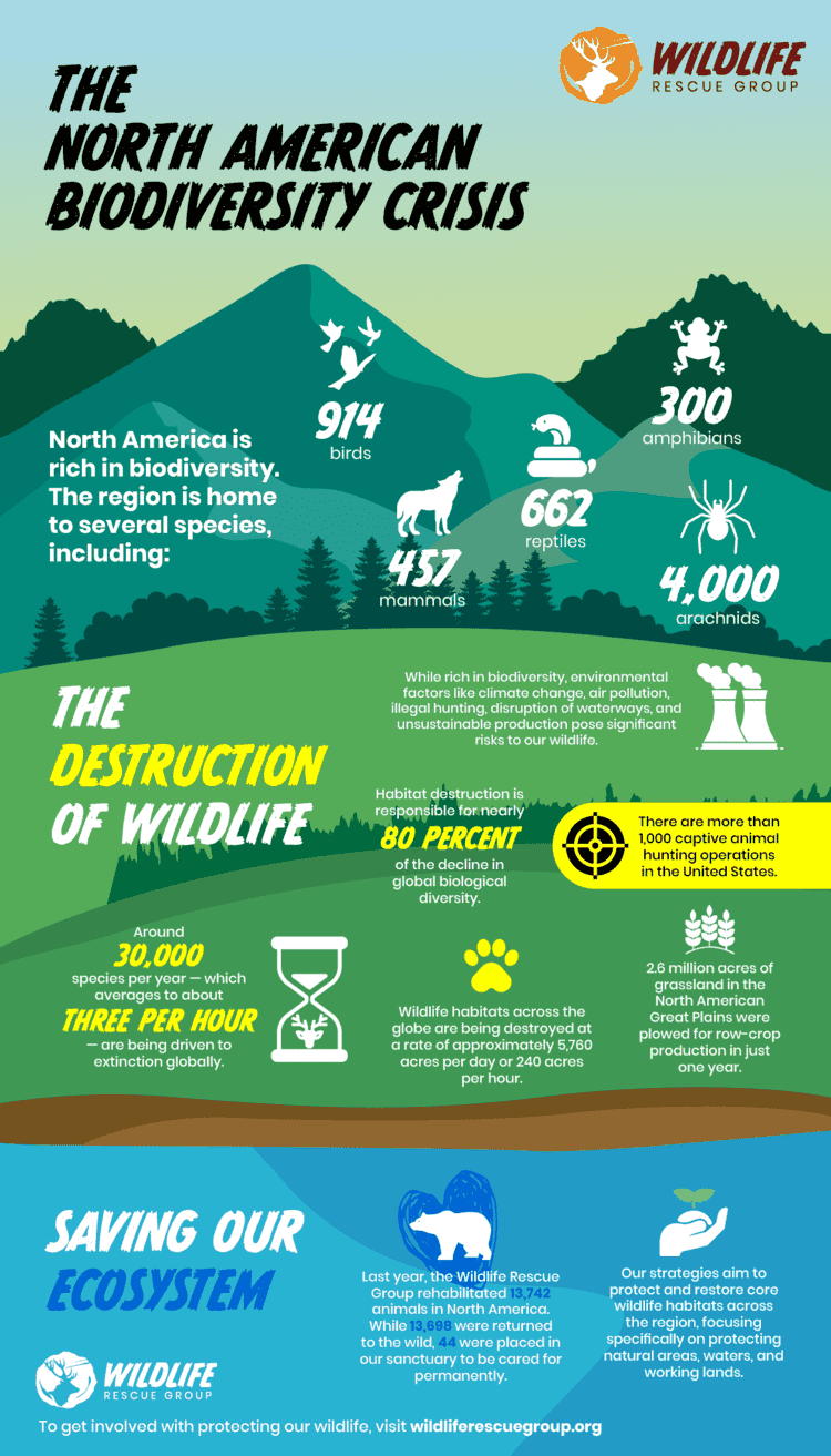
Pairing professional graphics, like the infographic their team designed above, with an attractive web design will result in a polished, informative website for your cause.
Promoting Matching Gifts on Your Nonprofit Website
As a key driver of corporate and individual giving revenue, matching gift programs should play a vital role in your organization’s overarching fundraising efforts. However, a significant lack of awareness among donors leads to these programs being underutilized each year.
Luckily, your nonprofit’s website can bridge that knowledge gap and encourage more donors to participate in these programs.
Consider these best practices as you incorporate matching gifts into your website design:
Host a dedicated matching gifts page.
In terms of driving corporate matching gifts, establishing a Matching Gifts Page is one of the most important resources your team can implement. This page should provide an overview of matching gift programs, emphasize key benefits for your organization, and share useful information regarding how donors can get involved.
Make the information easily accessible.
Your online matching gift content should be easy for visitors to locate on your website. Include your matching gifts page on your primary site navigation menu, share educational information from your organization’s blog, and more. Plus, you’ll want to provide resources on these pages that simplify the match process itself—such as your embedded matching gift database search tool.


Add a ‘matching gifts’ section to your Ways to Give page.
More than likely, your nonprofit website contains a page that encourages donors to get involved in a wide variety of ways. In addition to methods like peer-to-peer fundraising, in-kind donations, and more, we recommend adding a detailed section about how individuals can support your organization through matching gifts. It can even link to your more in-depth resource, your dedicated matching gift page, for those looking to learn more.

Highlight custom matching gift opportunities for corporate partners.
Not all companies offer standard matching gift programs, but that doesn’t mean they’re not interested in supporting nonprofit causes like yours. One of the best ways your team can engage these businesses is by pursuing custom (or “one-off”) matching gift programs.
To help, we recommend instituting a corporate interest page on your site—separate from your standard matching gifts page and targeting employers rather than donors.


Promoting Your Nonprofit Website
After creating a website design inspired by top nonprofit sites, you’ll need to drive traffic to it via regular promotion. All marketing materials and external communication should include links to your site. This encourages current supporters to visit for the latest updates and intrigues new ones to learn more about your organization. We’ve already touched on the importance of creating an SEO-friendly website and doing so will set your nonprofit up for success when it’s time to focus on marketing. A few ways you can optimize your website for search engine promotion include:
Outside of SEO, here are some quick recommendations that your nonprofit can use to promote its website:
- Link to your site on social media. Include links to your homepage or donation page in your nonprofit’s social media profile descriptions. Then, share blog posts and other web content with your followers. The best content can be engaged with on the social media site but also encourages clicking to your website for the full story. This type of content about your cause will make supporters likely to share your posts with their followers, increasing traffic to your site even more.
- Direct readers to your website from email outreach. You likely engage with your supporters through email marketing for fundraising appeals, matching gift messaging, mission updates, and more. Encourage recipients to learn more about your organization by including a link to your website (or specific pages, like your donation form or match page) in every email you send!
- Include your site’s URL in direct mail. Just because your website lives online doesn’t mean you’re limited to promoting it only through digital means. When you create a flyer or send direct mail to supporters, include the link to your donation form or another specific page on your site.
- Use paid advertising. Traditionally, paid advertising can put a massive dent in your marketing budget. The Google Ad Grants program changes that! Through the program, eligible nonprofits receive up to $10,000 each month to promote their websites through Google Ads. Pick valuable landing pages, perform keyword research, and create persuasive ads that inspire users to visit your site. Better yet, we recommend turning to a Google Grants manager to handle the work for you.

There are countless ways to promote your nonprofit website! Get creative, and you’ll drive more traffic to your site in no time.
Do you want to promote your nonprofit website using Google Ads?
Additional Nonprofit Resources
Guide to Matching Gift Programs

Amplify your fundraising success with matching gifts. Don’t let available funding slip through the cracks. It’s time to implement a proactive strategy!
Check out everything you need to know about these initiatives (including guidelines, companies with well-known programs, tech strategies, and more) here.
SEO for Nonprofits

An SEO strategy helps your nonprofit increase the visibility of its website by increasing organic traffic.
Planning and executing an SEO strategy can be overwhelming. Explore Nexus Marketing’s complete guide to SEO to get a rundown on how it works, how to get started, and who you can turn to for help.
Custom (or “One-Off”) Matching Gifts

Don’t overlook your organization’s potential for successful corporate partnerships! Custom matching gift initiatives can drive significant impact.
Learn more about these unique programs, their key benefits, and how your team can maximize the opportunity with this in-depth resource.