7 Steps to Design Your Nonprofit Logo
At the end of the day, people expect logos from every business, organization, and nonprofit. Having a good logo is integral to your nonprofit’s branding, just like your organization’s name. A good logo is one that stands out, sticks in your supporters’ minds, and represents your mission.
In this guide, we’ll explore the ins and outs of designing a nonprofit logo, including:
A strong logo design strengthens your organization’s branding and makes a strong first impression on prospective supporters. Along with other promotional materials, your logo should be incorporated into your nonprofit’s graphic design strategy. Your organization should strive to deliver a high-quality logo that represents your mission without having to say a thing.
How to Design a Nonprofit Logo
Step 1: Finalize your name.
Ideally, your nonprofit should already have a compelling name before you embark on your logo design journey. If you don’t have a finalized name or aren’t happy with your current one, focus on ironing out any kinks before you start designing.

Your name also conveys information about your mission and the overall tone your organization carries. The name should cultivate an accurate and engaging first impression of your nonprofit to boost brand recognition. Remember to finalize any spelling and formatting preferences before you design your logo.
Step 2: Develop your core message.
Your organization’s name makes it identifiable to your supporters. Your core message, on the other hand, is influenced by your mission statement and slogan to identify what kind of impact your organization is making.
The values in your core message should guide every decision your nonprofit makes. Whether you’re choosing the right fundraising idea or developing your organization’s marketing strategy, come back to the principles outlined in your core message. Your logo serves as a visual, public-facing way to communicate these principles.
Finalizing your mission statement and creating a strong slogan gives you a solid jumping-off point for developing your logo. A slogan condenses the most important parts of what you do into a few key words. If you get stuck or off track while designing, refer back to your slogan to zero in on key concepts from your mission.
Step 3: Build branded elements.

Your brand guide should inform graphic design decisions across all platforms and channels. Include details like hexadecimal (hex) color codes and typeface names in the guide to encourage consistency down to the smallest details. With a thorough brand guide, any designer can reference it and replicate your nonprofit’s branding in their work.
Keep in mind that visual elements like color can signal things about your nonprofit. For example, this logo from Harlem Children’s Zone uses bold, bright colors. Colors like these communicate the nonprofit’s focus on helping children in the Harlem community with visual cues viewers pick up on at a glance.
Another example of the meaning of color in a logo is Greenpeace’s logo. Green is often associated with nature, environmental causes, and health. By using green in their logo, Greenpeace visually signals that their organization is concerned with creating a greener world.
Step 4: Choose a symbol.
Your organization’s name and core message can be translated into a visual symbol to quickly communicate your mission to supporters. The symbol you choose should represent what your organization does and be as unique as possible.
One way to develop a symbol for your logo is to narrow down your mission statement to just two or three main words. If you have a slogan, use it to inform what you create. Then, brainstorm other word associations and visual elements that communicate your mission.

We’ve all heard the saying “a picture is worth a thousand words.” The Girl Scouts of America logo is a great example of how symbols can convey a powerful visual message that might require lines and lines of text. This logo shows a lucky four-leaf clover and layers the silhouettes of three girls looking forward to the future, indicating the organization’s dedication to progress.
For some nonprofits, simpler is better. Organizations like The Water Trust choose to use only text in their logo. Even if you create a more text-heavy logo, there are still clever ways to include symbols that go the extra mile to convey your mission. In its logo, The Water Trust uses text, color, and clever symbols to convey that its mission involves helping people get water.
Step 5: Create the logo.
Use a nonprofit graphic design service like Kwala.
The best way to get a logo for your nonprofit is to use a graphic design service. While creating the logo yourself can save money, it’s best to invest in professional services when dealing with something as central to your brand as your logo. Professional designers have the skills and expertise to ensure your logo is visually and technically sound.

If your organization chooses to work with Kwala, the process will look something like this:
- Contact the Kwala team and meet your team of professional designers.
- Describe what you’re looking for to the designers. Kwala’s flat rate pricing and unlimited designs allow you to get as many high-quality designs as you need each month.
- Review your designs and submit as much feedback as you’d like with Kwala’s unlimited revisions.
- Use your new designs to market your nonprofit across all marketing and advertising channels.
After receiving your design from Kwala’s team, your nonprofit can continue using the service for other graphic design materials. Because Kwala focuses on understanding the unique nonprofit landscape, its designs are tailored to address the challenges of nonprofit marketing.
Build the logo yourself.
If you’re unable to work with a professional designer, there are other ways to create a strong logo. To ensure your logo accurately reflects the best parts of your organization, follow these tips:
- Avoid logo makers. Try not to use logo generators or makers. While some of these tools might yield high-quality logos, most of them look a bit cookie cutter. It’s hard to have a memorable logo if it looks like everyone else’s.
- Create the logo from scratch. It’s best to create the logo from scratch on a reputable program like Adobe Illustrator. Your logo should be the centerpiece of your branding efforts, and it will be your nonprofit’s chief identifying factor for years to come. Make sure it’s created with care and attention to detail.
- Ask for help. Don’t be afraid to reach out to your network of supporters for assistance. One of your volunteers could be a professional designer willing to create a logo for free. Even if your supporters with expertise are unable to design a logo for you, you can use them as a knowledgeable resource for questions and concerns.
If you create your own logo, be sure it’s one of a kind. It’s easy to cut corners to save time and money, but your logo is something you should invest in.
Step 6: Review and revise your nonprofit logo.

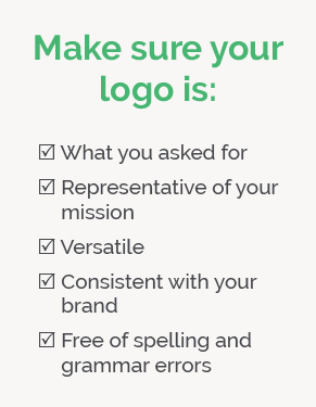
First, make sure the logo is what you want. If you used a designer, make sure they incorporated each element you requested and that it effectively represents your organization. One way to test this is to show the logo to people who aren’t familiar with your organization and ask what their impression of your nonprofit is.
Next, try to envision the logo across the various media channels it will be used on. Picture it in email signatures, on the corner of social media posts, and front and center on t-shirts. Ask yourself if it will look good and represent your mission in all of these scenarios.
Last, do a sweep for any basic mistakes. This could be spelling errors or the use of fonts and colors outside of what is detailed in the brand guide. It’s best to catch these mistakes at this stage rather than after you’ve printed logos with typos on 100 copies of a brochure.
Step 7: Develop variations.
Once you have a complete, finalized version of your logo, consider creating variations. Using your parent logo, tweak the design so the logo will work no matter when, where, how, or why it’s used. Your logo will be used on everything from social media infographics to thank-you letters, so it’s crucial that the style of the logo matches the occasion.
For example, the American Heart Association’s full logo includes their symbol and name, and it’s usually used in more formal settings like on their website. However, the organization uses a simplified version for informal content like Instagram posts.
Nonprofit Logo Design Best Practices
Keep your design simple.
Knowing when to stop is one of the most challenging parts of graphic design. It’s easy to get carried away attempting to fit everything you love about your organization into your logo. But fitting everything in your mission statement into a tiny logo is next to impossible.
As you work on creating a clean and simple logo, keep these tips in mind:
- Only use one trick. Not every element of your logo needs to be revolutionary. Choose one unique or special feature that will help your logo stand out from the crowd and limit everything else to the background.
- Don’t be afraid to trim. You’ll likely need to cut some of the elements in your logo after the first draft is complete. Take a hard look at the logo and remove anything that isn’t absolutely necessary. Anything that can be qualified as simply “decorative” should be removed.
- Consider choosing between text and graphics. Text and graphics both have their merits, but sometimes using both of them weighs down logos with unnecessary information. If your symbol seems like it’s repeating your nonprofit’s name or vice versa, consider removing the weaker element from the logo.
Remember that most viewers won’t take much time to study your logo. Social media viewers in particular will likely glance at the logo for one or two seconds before scrolling on. A simple logo is the best way to communicate your message to as many people as you can.
Make sure your logo can stand alone.
Your logo will end up featured across many different websites, pieces of merchandise, social media posts, and other media. You shouldn’t have to explain what your logo means for it to make sense to whoever views it. Make sure it can stand alone in any scenario.
As you design your logo, consider where it will show up. For example, if your logo will be posted on a social media platform like Instagram most frequently, tailor the logo to align with social media users’ preferences. In this case, the logo should be extremely simple so anyone quickly scrolling through their feed on a small smartphone screen can still register and make sense of your logo.
This logo from the World Wildlife Fund is a great example of a logo that can stand alone, particularly on social media. It doesn’t need a long name or written description to explain what it means. However, the United H.O.P.E. Foundation’s logo might be difficult for viewers to understand without reading five lines of text below the symbol.
Additional Resources
Designing a logo for your nonprofit is a serious undertaking that requires significant amounts of planning. Deep knowledge of your organization’s branding and mission statements is critical, especially for young nonprofit organizations. A strong logo design will help your organization stand out from the competition and show your supporters what you care about.
If you’re looking for more information to help guide your organization’s graphic design journey, check out these resources:
- 12 Best Nonprofit Graphic Design Tools. Looking to learn more about nonprofit graphic design tools? This guide features the 12 best tools so you can choose which ones are right for your nonprofit.
- 5 Types of Nonprofit Graphic Design Your Organization Needs. It’s easy to forget to create some graphic design materials, especially when there are so many different kinds. This guide highlight the five most important types of graphic design your nonprofit should have.
- Essential Guide for Choosing a Graphic Design Company. Is your nonprofit considering using a graphic design service? Check out this guide for choosing the right company to meet your nonprofit’s unique needs.


