Feature Matching Gifts on Your Homepage and Across Your Website
Your homepage is the first thing people see when they visit your site, and priority number one is letting people know who you are and what you do. Part of what you do is receive donations, and matching gifts for those donations, so including links to information about matching gift programs is a good idea.
The two approaches (which can be combined, of course) are placing matching gift links such that people can find them if they are looking for them (navigation bars) and inserting links so that they jump out at site visitors, such that the link is more or less an advertisement for matching gifts (banner ads).
Let’s take a closer look at each approach through proven strategies.
Navigation Bars
Every useful website has a navigation bar that helps people to discover relevant information. Including a link to matching gift programs in your navigation bar puts matching gifts in a visible location where donors can easily find and access the information. A link in the navigation bar won’t advertise matching gifts to unknowing donors, but if a donor is on your site and looking for how to apply for a matching gift then he will easily be able to navigate to a page to learn how.
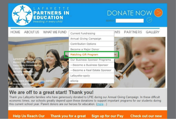
To get a better idea of how navigation bars work, here’s an example from Lafayette Partners in Education:
Screenshot of Lafayette Partners in Education’s Website
(http://lpie.org/)
This is a clean, modern site, with an easily visible and useable navigation bar. They incorporate matching gifts under the fundraising tab, so it’s part of a larger topic. This link won’t function as an advertisement, but, for someone who is looking for matching gifts or ways which they can contribute to the organization, the website provides an intuitive way to access that information.
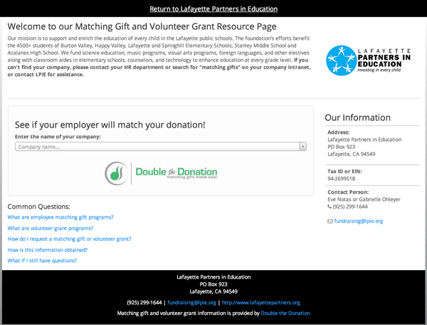
When a website visitor clicks on the “Matching Gift Program” link they’re taken to Lafayette Partner In Education’s dedicated matching gift page:
Screenshot of Lafayette Partners in Education’s Dedicated Matching Gift Page
(https://doublethedonation.com/lpie)
Banner Ads
If you want to advertise matching gifts on your homepage then banner ads are a great way to go. A banner ad will catch eyes and make people think about matching gifts. This informs donors about matching gifts when they may be visiting your site for other purposes.
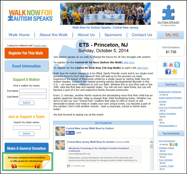
Here’s a banner ad in action from Autism Speaks:
Screenshot of an Event Page for Autism Speaks
Highlighted by the green box, this banner ad works because it’s clean, easy to read, and its color stands out from the color scheme of the homepage. People notice when something stands out in a crowd. A 2011 study in the journal Emotion claimed that reaction times become faster and more forceful when people see a bright color, so the choice of color was well selected. Little factors such as color can play vital roles in whether or not people respond to your banner ads, so if you have the time to get intricate with your banners it will be time well spent.
Autism Speaks also created their own custom matching graphics to include throughout their website. Examples of individualized banners used by Autism Speaks include:
Everything about these banners is clean and easy to read. The iconic puzzle piece logos add a touch of intimate personality that separates the images from plain text graphics. The difference in shapes, square versus rectangle, highlights that your banner can and should be tailored to the size that works best on your website.
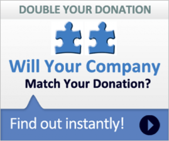
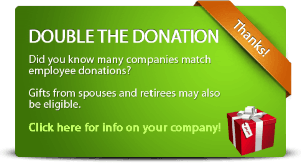
If you don’t have the time or the resources to create a banner ad, Double the Donation provides a host of banner options, such as:
Still clean and basic, this banner adds simple details, such as a faded color scheme and the orange ribbon in the top right corner. The image works great on donation confirmation screens, and make sure to link the graphic to your dedicated matching gift page.
The picture of the gift box is enough to signal to the user that this banner has something to do with giving or gifts prior to the user engaging with the white text. And the white text is easy to read and the large, capitalized letters, which will likely be the first words you read, tell you exactly what the box is addressing. As for the psychological effects of the color, green is commonly associated with balance and harmony, such as the balance a matching gift brings to the original donation and the harmony between you and donors. There are serious benefits to thinking out the minor details of banner ads in order to leverage major psychological impacts.
View additional premade matching gift graphics >
Your nonprofit does not have to advertise for matching gifts on its homepage, but it’s a good idea if you want to raise awareness for matching gifts. Regardless, including information about matching gifts in a logical place, such as a navigation bar, is a must.

